7 Print-on-Demand Store Homepages Worth Studying—and What to Borrow From Each
Quick answer: A useful print-on-demand homepage tells visitors who the store is for, helps them find a relevant product, and gives them a reason to trust what they see. The seven homepages below solve those jobs in different ways: Cotton Bureau clarifies two audiences, Wander Prints organizes by gifting intent, Society6 shows art in living spaces, Out of Print speaks a niche's language, Rapanui connects its brand promise with clear shopping routes, TeeFury focuses attention on a featured design battle, and Threadheads gives distinct collections a coherent voice.
These brands span artist marketplaces, personalized-gift sellers, and established retailers; their production methods differ. We selected them for distinct choices in navigation, imagery, and trust. A homepage alone cannot show how well those choices convert. We reviewed the live sites in September 2026 and captured the 16:9 storefront images directly from their homepages. Seasonal banners and featured products may change.
1. Cotton Bureau: give creators and shoppers separate routes
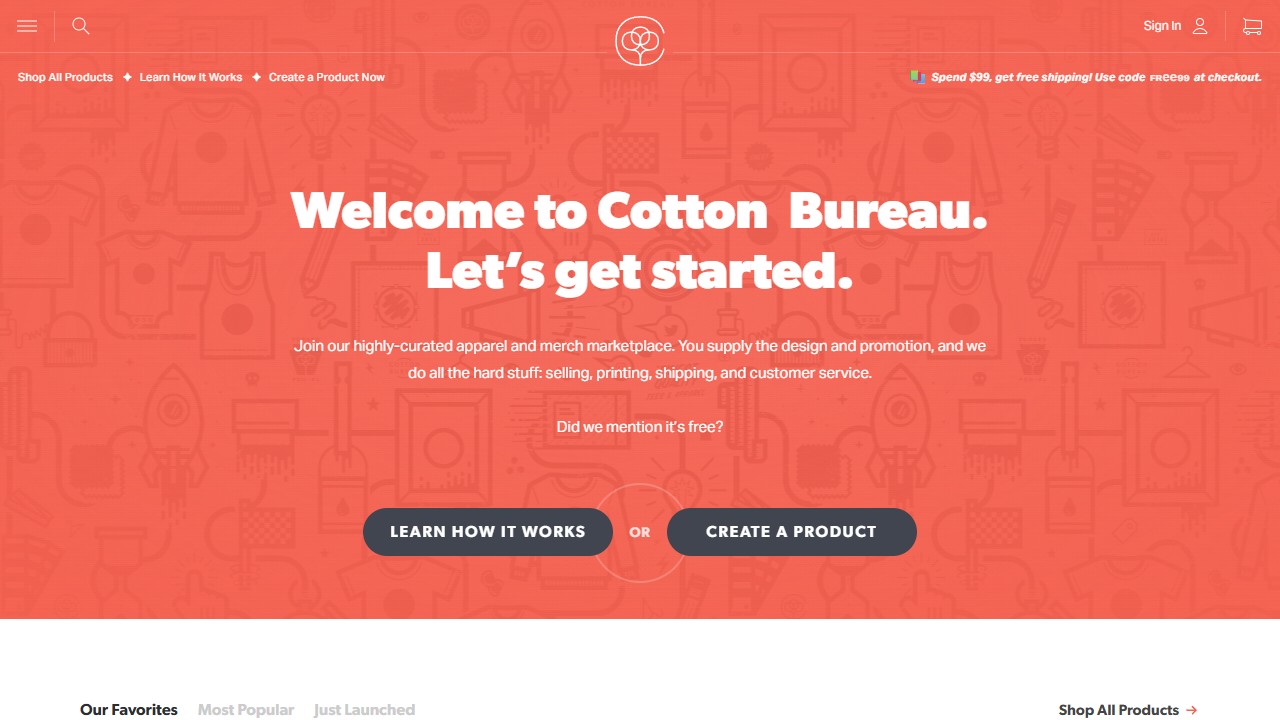
Cotton Bureau serves two groups: people buying artist-designed merchandise and people who want to create it. Its homepage does not make either group guess. The navigation offers “Shop All Products” alongside “Learn How It Works” and “Create a Product Now.” The welcome section explains the creator proposition in plain terms: supply the design and promotion; Cotton Bureau handles selling, printing, shipping, and customer service. A curated product grid follows.
What to borrow: If your store has more than one primary audience, make the paths unmistakable. A visitor who wants a gift should not have to pass through a pitch to creators, and a creator should not have to search the footer for the submission page. Give each route a clear label and destination. A small POD store with only one audience can simplify further: one promise and one main action above the fold.
Explore Cotton Bureau in the directory.
2. Wander Prints: organize around the buyer's reason for shopping
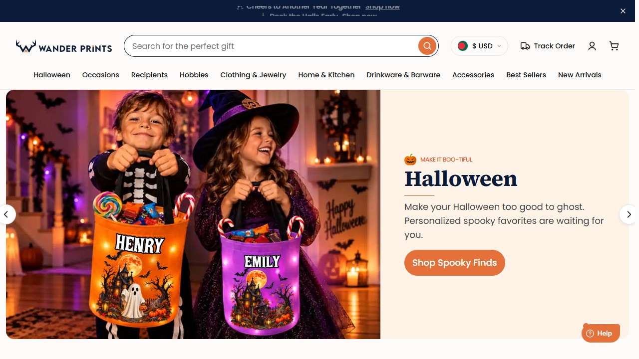
A shopper looking for a personalized gift often starts with a person or occasion, not a product type. Wander Prints reflects that. Its homepage asks who the visitor is shopping for, with routes such as couples, pet lovers, grandparents, and coworkers. It also lets visitors browse by occasion, including birthdays, housewarmings, and anniversaries. Product categories are still available, but they are not the only way in.
What to borrow: Name collections the way customers describe the purchase. “Gifts for new dog owners” may be a more useful route than “Mugs” if that is what your audience came to find. Start with a few distinct buyer intentions that your products genuinely serve, then make those links lead to focused collections. Avoid adding occasion labels simply because they are popular search terms; each destination should feel curated.
Explore Wander Prints in the directory.
3. Society6: show the product in the space it belongs
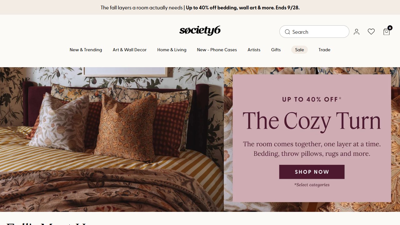
Society6 sells art and home decor, so the product makes more sense when a visitor can picture it in a space. Its homepage pairs styled room photography with a “Shop By Room” section for bedrooms, bathrooms, offices, and living rooms. The site also gives independent artists a visible place in the story. That combination connects design discovery with the room a customer is trying to change.
What to borrow: Show what the customer is buying and how it lives in the real world. A print seller can pair a clean artwork image with a believable room view that communicates size. An apparel store can show a graphic close-up alongside a full outfit. A mug or stationery store can show the item in use. Keep the product itself clear; lifestyle imagery should add context, not hide details.
Explore Society6 in the directory.
4. Out of Print: build navigation around a shared interest
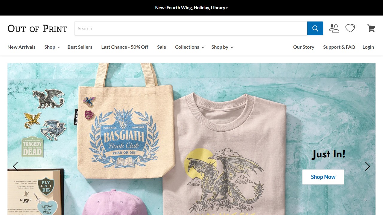
Out of Print sells across shirts, totes, socks, and home goods, but its strongest navigation is written for readers. Visitors can shop by book title, author, genre, or collection as well as by product. The homepage presents merchandise as part of a literary interest, rather than a stack of unrelated printed items.
What to borrow: Lead with the language of your niche. A hiking brand might organize collections by trail culture or place; a pet brand might organize by animal or breed; a gardening brand might organize by plant lover, pollinator, or season. Product-type navigation still matters, but the niche route gives a shopper a reason to explore. If you reference books, characters, teams, or other protected work, use only material you have the rights to sell.
Explore Out of Print in the directory.
5. Rapanui: pair the brand promise with clear shopping routes
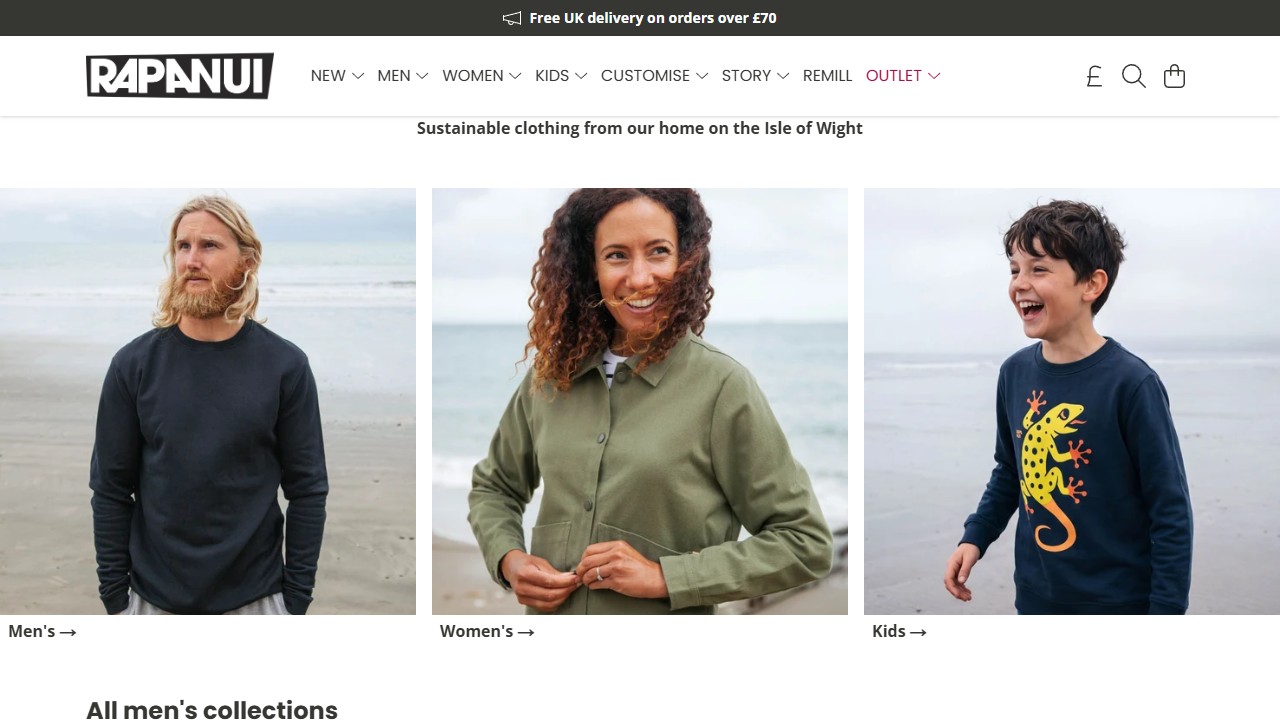
Rapanui states its sustainable-clothing promise near the top of the homepage, then immediately gives visitors three clear routes: men's, women's, and kids' clothing. Links to its story and Remill sit in the main navigation for shoppers who want to understand more. The page keeps the brand's point of view visible without making visitors work to find a product.
What to borrow: Put the practical shopping decision next to your broader brand message. If sustainability or another mission is central to your store, say what it means in specific terms and link to a page that explains the work. Then give visitors direct paths into the relevant collections. A claim can start the conversation; clear navigation lets people act on it.
Explore Rapanui in the directory.
6. TeeFury: focus attention on a changing featured event
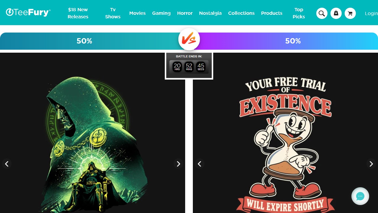
TeeFury opens with a design battle: two featured pieces face off above the broader catalog, with a timer showing when the feature ends. The format makes the first decision simple and gives the artwork room to carry the page. Visitors can still browse product categories after the featured event.
What to borrow: Give one small, well-chosen group of designs the strongest position on your homepage. A weekly artist feature, a new collection, or a pair of contrasting designs can be easier to understand than an undifferentiated grid. Use a countdown only when the offer truly has a deadline, and make the buying path clear once a visitor chooses a design.
Explore TeeFury in the directory.
7. Threadheads: let the brand voice guide the collection structure
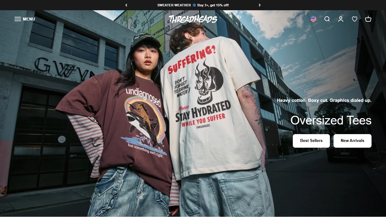
Threadheads gives its homepage a recognizable voice through bold photography and direct collection labels. It moves from oversized tees to basics, collaborations, and custom printing without presenting them as one undifferentiated wall of products. The custom section makes its offer particularly clear: shoppers can bring their own design to the brand's press.
What to borrow: Give each major collection a purpose and a distinct visual cue, while keeping the site's overall tone consistent. If your store sells several styles, do not make a visitor infer the difference from tiny thumbnails. Say what each range is for, show a representative product at a useful size, and give it one clear link. Borrow the clarity of the structure, not another brand's artwork or voice.
Explore Threadheads in the directory.
A five-minute audit for your own POD homepage
Open your homepage on a phone and ask someone unfamiliar with your store to look at it for five seconds. Then ask them three questions: Who is this for? What can I buy here? Where would I click first? If any answer is unclear, the examples above suggest a place to start.
- State the promise. Use one sentence that names the audience and the product or outcome.
- Offer a useful first step. Make the main action obvious, whether it is shopping a collection, finding a gift, or creating a custom item.
- Organize by intent. Add a small number of collections based on how customers think, not only on your product inventory.
- Show the finished product clearly. Pair design details with real-world context and scale.
- Back up important claims. Give visitors specific evidence for quality, shipping, customization, or a stated mission.
A strong homepage does not need seven sections. It needs the right path for the person who has just arrived. Study these stores for the choices behind their pages, then make those choices fit your own audience and catalog. For a broader review of brand presentation, read our guide to what makes a print-on-demand store look professional.